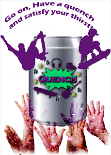
For my print advert I used all the conventions. This
includes the main image, a slogan, a logo and masking layers. I cut out my main
image, the hands coming out from the bottom, using the quick select tool. I
fixed the size of it, increasing and decreasing it, using the scale tool. Afterwards,
I copied this layer three times and had them layered over each other to make it
look effective. On the first layer I had the original image, on the second
layer I made it grey and on the third I masked it using a purple bubbly masking
layer. I think I did well at masking the main image however the quick select
tool turned out to be tricky especially when you’re cutting out the hands.
I used the masking tool and my main image to make it look effective.
The purple layer was used to represent the taste of blackcurrant within the
drink and the bubble effect makes it seem that you are thirsty and want to
drink the drink. Also, the effect of the layer makes it eye catching which will
bring the audience to see it and be interested by it. It also makes the target
audience, which are males, want it because the bubble effect not only makes it
look refreshing but also “cool” which our target audience will be aiming for.
Colour Palette:
I used different colours that all fit in will each other
effectively to represent this drink. First of all I’ve chosen purple. This is
because it represent the blackcurrant taste in the drink which is obviously a
purple fruit. This is effective as it makes the audience visualise the blackcurrant
and therefore also visualise tasting it. This will then make them thirst and
want to try it. The colour purple not only is the colour of the blackcurrant
but its also a popular colour with makes between the ages of 17-20 and is
considered a “cool” and “outgoing” colour. Therefore this appeals to the target
audience. A second colour used is green. This also represents an ingredient in
the drink, which is apple. Just like the effect with the purple represent the blackcurrant,
the green represents the apple which makes you want to try the drink. The two
colours complement each other well as they are both vivid bright colours.
Position of
conventions:
There are lots of conventions being used. 1st of
all, the slogan. The slogan is at the top to show its importance because it
basically is what the product does and is one of the main things that attracts
the audience to the advert. It’s also catchy and therefore rememorable which is
useful as it means the target audience can remember the drink if they want to
buy it. A second convention is the product itself and this is right in the
middle of the poster as it is the most important thing and we want to grab the
attention of the audience. It is also quite big which means, again, it will
attract the audience. Another convention is the hands at the bottom. They are
positioned to be in the air, reaching upwards, towards the drink. This suggest
that everyone’s hands will do the same as they want the drink and are all
wanting to grab it. It’s also like they are praising the drink as it’s so good.
Also they’re a few images of skateboarders “jumping out” as its eye catching
and our audience is boys that are “skater” like.

