Wednesday 25 September 2013

Radio 1


Radio 1=
Targets a range of young listeners with a mix of contemporary music and speech. Target audience is 15-29 year olds but also has some programming for younger teenagers. Range of new music and emerging artists. Relevant news and documentaries also provided for young adults.

BBC got rid of Chris Moyles in the attempt to have young listeners with new presenter Nick Grimshaw. Chris attracted people that were much older than the initial target audience so Nick came in to hopefully attract a younger rang of listeners. However, Nick Grimshaw actually reduced the number of listeners with the lowers listeners it’s ever been since 2003.


Choice FM and BBC radio both have quite similar target audiences.

meeting minutes


Minutes for marketing meeting
Agenda (information that will be discussed):
List of who is in your group and information about your company: name and contact details.
In your groups brainstorm/list ideas about your ideas radio show
Define your target audience using information about yourselves and your ideas.
Complete the proposal form

Date:
Present:

Item (what you are discussing)
Actions (ideas that were discussed with final decisions highlighted in yellow)
List of who is in your group and information about your company: name and contact details.

In your groups brainstorm/list ideas about your ideas radio show

Define your target audience using information about yourselves and your ideas.


Proposal for your radio station.

What is your radio station called?
YouMusic
Who is involved in your group?
Xhesi Abdurahmani, Lauren Young, Emma Cosgrove and  Jade Inwood
How is your radio station going to be funded?

What genre of music and shows are you going to feature on your radio station?

How will people be able to listen to your radio station?

Who is the target audience for your radio station?


comparing commercial and non-commercial


Compare commercial and non-commercial radio

Commercial radio is a radio station that has adverts included into its shows. However, non-commercial radio has no adverts. Commercial radio is therefore funded by companies of the product paying the radio show to broadcast their advert. This is how commercial radio gets funded and how they then can pay for their shows. On the other hand, non-commercial such as the BBC gets funded by the TV license. Everyone who owns a TV, in Britain, has to pay for the TV license because the BBC was created to educate viewers so it’s for our own benefit. Therefore, the money the BBC gets from people paying the TV license is used so they can pay for their shows.  The advantages of being a commercial radio station money-wise are that a big company can pay the radio station to advertise their adverts for a long period of time which overall results in a lot of money.  Also, commercial adverts have a constant stream of money because they are always getting paid for different adverts at different times. However with non-commercial stations, they get paid a massive amount of money all at once so they need to spread it out which is harder for them to manage their money. However, an advantage of being a non-commercial station financially is that you are always guaranteed money because everyone in Britain pretty much has to pay the TV license therefore you are always in a safe place as you are always going to have money. Whereas with commercial adverts, they are not always guaranteed adverts or very big amounts of money.

The ethos of BBC radio 1 is “To enrich people’s lives with programmes and services that inform, educate and entertain.” Whereas choice FM has the ethos “Choice FM's website is the place for listeners to discover new music, interact with DJ’s and other young” They are quite similar because both state the intentions that each radio station has and what their purpose is.  However, they are different because BBC 1 has a more formal message and is more in the section of education whereas choice is mainly for entertainment purposes and is more “street” like. I think the better ethos is BBC 1 as its short but sticks in your mind and simply tells you the purpose of their station. Whereas choices ethos was very long and I just shortened it. People might not remember choice ethos as it’s too long and also whilst reading, they may have just ignored it and moved on because they lost interest.  I think they both live up to their ethos quite well. BBC does indeed educate and entertain their audience and choice does play new music and therefore allow the audience to communicate with the DJs. I do think that choice lives up to its ethos more because they attract listeners from their target audience which is proof that they’re are living up to it. With BBC their ethos say to educate however Chris Moyles and now Nick Grimshaw do not educate but instead make jokes and say funny stories which is more of an entertainment content.
The target audience of BBC radio 1s is 15-29 (although they reached an average of 33) which is very similar to choice FMs target audience of 15-40 even though most of the listeners are more towards the lower scale of teenagers and young adults.  They are similar because most of their listeners are teenagers and young adults. However, their audience is different because choice FM provides more urban music to appeal with their target audience whereas BBC radio has more mainstream music with a wide range and variety to attract a large range of listeners.  BBC used to have more than 6 million listeners when Chris Moyles presented the show whereas now it has dropped to 5.5 million since Nick Grimshaw has been presenting. Although this has happened, BBC radio still has more listeners than choice which has around 500,000 listeners.  Although BBC radio 1 has more listeners, Choice FM attract more of their target audience with achieving their target of attracting teenagers whereas BBC radio has a target of 15-29 when in fact their average is 33 years old. This therefore means that Choice is more successful I attracting their target audience.


 [XA(1] Wonderful work , you have compared the stations clearly and started to evaluate some of your ideas. Distinction skills.
Target: evaluate each of your topics thoroughly. If Radio 1 ethos is to educate have they really achieved this? What is your evidence for this?

Friday 15 March 2013

Evaluation about meeting minutes

I think that I interacted with the group and contibuted lots of ideas. If I agreed or disagreed with someone else in the group I would tell them and see if we could compromise. For example, some of the members in our team thought it should be for the older generation where as some thought it should be for the younger generation. We decided to have 3 target audiences that had a wide range with both the younger and older generation. We didnt have any major disagreements which is good, we all worked well in a team. We came up with loads of ideas and contirbutions. As a scribe, I managed to time up all our ideas into the meeting minutes and understood everything. To improve, I could have typed quicker and more corrrectly and gramatically but I think that was due to the fact I was tring to type quickly, and we checked over spelling and grammar at the end. I think im working at a Merit because I did have lots of ideas however, I could have described them in more detail.

Meeting Minutes McFly


Date: 13/03/13

Present: Everyone except Lauren Young


Item (what you are discussing)
Actions (ideas that were discussed with final decisions highlighted in yellow)
What we will be putting in our print advert
X.A said that we should use the colours red as the song is about love and will attract to the audience, also red is a unisex colour so will appeal to both men and women.
K.K agrees but thinks we should also use another colour
L.W.I thinks we should use bright colours to show that its really easy and it makes you happy
 
Who our audience is
A.K thinks that 20-30 year olds should be the target audience
K.K disagrees because the older generation wont be attracted to them and find them very appealing
X.A agrees with K.K because the music of McFly is more of a younger generation
L.W.I agrees but also for the older generation because they might want to feel young again and nostalgic
K.K compromises and suggest that we do 15-25 as it’s a good wide range of audience
L.W.I thinks that the audience should also be 15-25 because they will want to be like McFly and want to be successful like them and achieve something.
X.A thinks that the audience will also be appealing to children because they might look up to them and enjoy their poppy music
A.K agrees because some older people don’t spend time listening to music and children do so it will appeal for them.
K.K young males may like them because they grew up with them
X.A agrees because they will inspire to be like them however, McFly is more for women as they are a young boy band and are trying to attract girls
K.K also agrees that it’s for girls as the men in McFly are attractive and will obviously be appealing
Advert idea 1 – website advert (banner)
X.A I think it should be featured on YouTube because McFly are a boy band and therefore music is their career. So, this is why I think it should be on YouTube because YouTube is a popular website used mostly to listen to music.
K.K agrees but thinks it should also be on Facebook because it’s really popular and most people go on it. 15-20 year olds will be attracted to this because it’s social media so they will think its popular.
L.Y thinks that the technique used should be humour because it will appeal to the younger side of that audience and appeal to the fact that they are young and energetic
K.K agrees because she knows from experience that 15-20 year olds have a lot going on in their life at this point and humour could relax them.
Advert idea 2- tv advert
L.W.I thinks it should be on MTV as it is a music channel and McFly make music. Also the target audience for MTV is for teenagers and young adults and this is also the target audience for McFly so it all fits in
A.K agrees because most songs feature on music channels so it’s well suited for McFly
X.A thinks that it should also be featured on e4 because that channels has loads of comical TV shows which are mainly targeted for women, like McFly, and also if McFly feature on e4, they will think McFly are funny guys and therefore they will think it’s genuine.
K.K this could be for 20-25 year olds because they are most likely to watch the comedy shows featured on e4.
L.Y thinks that the technique used for this should be nostalgia because 20-25 year olds grew up listening to McFly and will want to be reminded of their past. She also thinks that the advert used should be an interview type of advert for about 30-40 secs and then go to a bit of the song saying its released now.
Advert idea 3- Print advert
X.A thinks that the print advert will appeal to children because children go out and play with their friends so along the way, if they see a print advert on a billboard, they will be attracted to it and tell their mum or friends or whoever they’re out with. Also the colours will attract them as they are bright and eye-catching.
L.Y thinks it shouldn’t be a billboard but in a children’s magazine because they’re more likely to see it in a magazine rather than a billboard.
K.K agrees because children take more notice of children’s magazines than billboards.
L.W.I thinks that they should put some environmental friendly content in the magazine to make McFly look like good, genuine people so then their parents will think that McFly will be good for their children.
L.Y says that the technique used for children should be shock because they will be impressed by McFly and think they are “cool”
A.K thinks the psychographic group for the magazine should be aspirers because the children will aspire to be like McFly.
L.Y agrees but also thinks explorers because they want to try new things.


Wednesday 6 March 2013

Maroon 5


Maroon 5 catwalk concert- Victoria’s secret:

Men- they want to buy the song so then they can get a woman that is like a Victoria’s secret model- aim to get a sexy woman

Woman- want to buy the song so they can get a nice figure and aim to be like the models but also so they can get a rock star boyfriend (Adam Levine)

The target audience is for adults as the lingerie is expensive so not a lot of children have the money for it! Upper class-Middle class audience

An alternative interpretation is that people will be put off as they will feel uncomfortable and “fat” as they don’t have a body like that.

The technique is reward because men get woman and women get a sexy figure and a boyfriend.


Album cover:

Black and white because it reminds us of the 60s (nostalgia). It’s a tribute to Mick Jagger. Trying to associate themselves with the 60s and the rolling stones so older people can be attracted to it. The older generation will be happy that Maroon 5 remember that kind of music and appreciate it as not many people nowadays remember it.

The orange on the album cover could be there to update the black and white image and make it seem exciting. Also the orange is a happy and joyful colour.

Maroon 5 are the more important and main artist in the song so they are at the top. However, Christina Aguilera is at the bottom as she is only featuring in the song.

When people in their 20s see Christina, they will remember their childhood as they were teens back then when she was most famous.

Maroon 5 news article:

Found on a website (MTV) this means that the target audience would be young adults/teens.

Only Adam Levine is being interviewed, he’s the focus. They show a picture of him being topless which makes the women feels attractive to him. Appealing to girls who like looks rather than the music. Trying to make him look like a pin-up so young teenage girls will want to have a poster of him on their wall. Males will also like him as he has tattoos which will make men think that he’s manly and want to listen to his music because he’s cool!

Friday 1 March 2013

Coca Cola print advert


This advertisement is aimed for any gender but is specifically aimed at older people. This is because they use nostalgia to attract older people to the product. The faces of the famous people on the bottle were around the time of the older generation and therefore the new generation wouldn’t be familiar with their faces. However, it could also be aimed to them because they might believe that if they drink the coca cola, then they would become icons just like the people on the bottle. The psychographic group would be aspirers. This is because they would want to aspire to be famous just like the people on the bottle. Also the resigned as they love happy memories and want to remember old times. This advert makes us feel proud that we had these great icons in our generation and also aspirational as the drink makes us inspire to be like them.

Colour Palette:

The colours used are red and black. The black could represent the “little black dress” which is a timeless classic like the icons on the bottle. This suggests that if you drink it, you will become an icon and never go out of style. The red shows the drink being energetic just like the people on the bottle who were full of energy and achieved great things in their life obviously using that energy. This shows that if you drink it, you will be full of energy and achieve great things. These two colours work well together because they are eye-catching, attracting the audience’s attention.

The Logo:

The logo is obviously the well-known “Coca-Cola” logo which is always on and always the same on every coca cola product. The logo is in the middle so it stands out from the bottles background. The logo, just like the celebrities, is a well-known classic and has been around for years so it is very well recognised. The logo is placed in the middle, surrounded by the celebrities, to show that it too can be iconic.

The Slogan:

The slogan used in this print advert is “A classic never goes out of style.” This shows that the drink is a classic just like the celebrities on the bottle. It also shows that coke will always be “in style” suggesting that it will never leave and it will always be there when you need a drink. It also makes the buyer think that if they buy it they will be “in style” Also the slogan is black relating back to the little black dress and how it is always in style.
Strong Key Image:

 
The main image is the bottle with all the iconic faces on the bottle. This appeals to both the older and younger generation. Older because they feel nostalgic towards the drink and they remember old times and memories whereas the younger generation will want to inspire to be like the celebrities. Its also very interesting which makes it eye catching as the collage of faces are interesting to look at.

 
I think the conventions help greatly with selling the product as it appeals to a wide range of audiences which help more products get sold and therefore more money that the company earns.

Sunday 24 February 2013

Quench Evaluation


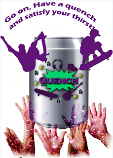
For my print advert I used all the conventions. This includes the main image, a slogan, a logo and masking layers. I cut out my main image, the hands coming out from the bottom, using the quick select tool. I fixed the size of it, increasing and decreasing it, using the scale tool. Afterwards, I copied this layer three times and had them layered over each other to make it look effective. On the first layer I had the original image, on the second layer I made it grey and on the third I masked it using a purple bubbly masking layer. I think I did well at masking the main image however the quick select tool turned out to be tricky especially when you’re cutting out the hands.Masking Layers:
I used the masking tool and my main image to make it look effective. The purple layer was used to represent the taste of blackcurrant within the drink and the bubble effect makes it seem that you are thirsty and want to drink the drink. Also, the effect of the layer makes it eye catching which will bring the audience to see it and be interested by it. It also makes the target audience, which are males, want it because the bubble effect not only makes it look refreshing but also “cool” which our target audience will be aiming for.
Colour Palette:
I used different colours that all fit in will each other effectively to represent this drink. First of all I’ve chosen purple. This is because it represent the blackcurrant taste in the drink which is obviously a purple fruit. This is effective as it makes the audience visualise the blackcurrant and therefore also visualise tasting it. This will then make them thirst and want to try it. The colour purple not only is the colour of the blackcurrant but its also a popular colour with makes between the ages of 17-20 and is considered a “cool” and “outgoing” colour. Therefore this appeals to the target audience. A second colour used is green. This also represents an ingredient in the drink, which is apple. Just like the effect with the purple represent the blackcurrant, the green represents the apple which makes you want to try the drink. The two colours complement each other well as they are both vivid bright colours.
Position of conventions:
There are lots of conventions being used. 1st of all, the slogan. The slogan is at the top to show its importance because it basically is what the product does and is one of the main things that attracts the audience to the advert. It’s also catchy and therefore rememorable which is useful as it means the target audience can remember the drink if they want to buy it. A second convention is the product itself and this is right in the middle of the poster as it is the most important thing and we want to grab the attention of the audience. It is also quite big which means, again, it will attract the audience. Another convention is the hands at the bottom. They are positioned to be in the air, reaching upwards, towards the drink. This suggest that everyone’s hands will do the same as they want the drink and are all wanting to grab it. It’s also like they are praising the drink as it’s so good. Also they’re a few images of skateboarders “jumping out” as its eye catching and our audience is boys that are “skater” like.

Monday 11 February 2013

quench poster


This is my advert for an apple and blackcurrent drink. The target audience are 17-20 year olds male who are the typical "skater" boys. I have included all the convetions and added masking.To improve I have to add a backround.